
New Features and Updates

Entry posted by David
7170 views
New Features and Updates
Revised Content Page
Our old "Guides" page has really been showing its age for a long time, and I've been meaning to re-code it for months now. I've finally gotten around to it, and although it's no where near where I think it needs to be, I believe it's much better than it was before. To better reflect the content of the page, I've renamed it from "Guides" to "Guides & Articles" (this will probably just be shortened to "Content" when people become more familiar with it). This change has also caused a slight re-ordering of the navigation bar, so that's why it was done if you've accidentally been clicking on the wrong application recently.
Article Image Slider
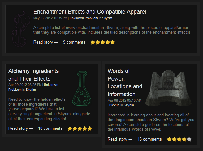
First up is a dynamic script that rotates articles and their descriptions alongside a large, related image. It has the usual features: automatic transitions, dozens of transition animations (some work better than others), manual controls, etc.

The script in action, with all of its automatic glory.
It's a pretty nifty addition, as it's able to pull the necessary information related to the articles out of our database automatically. It might not excite the standard guest much past whatever visual appeal it has, but as an Administrator I'm really excited about it. It only had a price tag of about $3.00, so as soon as Blexun stated he was in love with it I knew we must have it.
New Block Designs
To make a long story short, our old content page had a myriad of issues that began and ended with the blocks that featured articles. They had a horrific Web 1.0 look, wrapped unevenly, and always looked pretty messy in general.
An example of our old look.
After finally tiring of it, I spent a good two days and far too many hours trying to redesign the page. I made a lot of progress, and ended up with numerous different looks that I believed all look fantastic. Unfortunately, after implementing many of these designs I discovered just how impossible it was to look good on screens that were either small or have low resolutions. On my widescreen 1080p display, the blocks looked much different with one design than they did when I switched to a monitor with a 1024x768 resolution. A design would look fantastic on my high-res screen, only to look horrible on those with low-res. The low-res designs looked awful on high-res screens. I went back and forth for what seemed like ages, and I ended up trying to make a compromise so we have something that doesn't - at the very least - look horrible on either one.
The end result should look more or less the same on all displays, and fortunately eliminates many of the ugly bugs that the previous incarnation had (in theory).
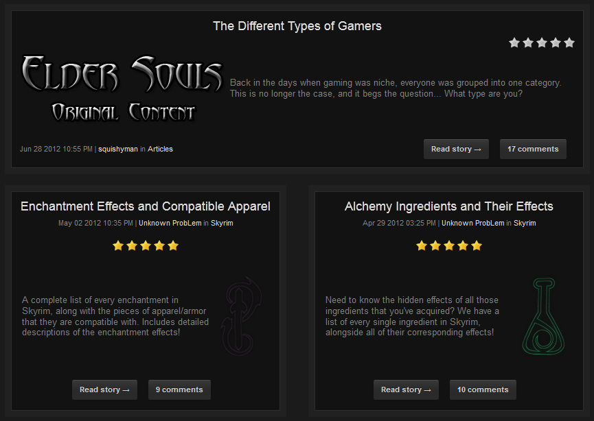
The new look.
Blocks should generally remain the same size as other blocks and center their contents, regardless of slight variations in screen resolution and size now. If you have anything 1024x768 or above, it should look pretty solid. I'm interested in hearing feedback from people as I can't really test this myself.
Again, this is probably going to change eventually. I was much less happy with it than I was with a few of the other high-res looks, but the fact of the matter is that it's nigh impossible to code something that's going to look the same to all users. Different operating systems, browsers, screen resolutions, color settings, and many other things all factor in to vastly different looks. You end up having to try to go for the lowest common denominator, and more often than not it doesn't scream sexy as a result.
Article Submissions
Pretty much all of this is going to fly right over everyone's head, but I'll include it for the few of you (Blexun and future Editors) who care or will be using this in the future. The rest of you can hopefully just be convinced that I do occasionally accomplish something here.
Form Redesign
In one of those rare instances I'm actually trying to make something look worse in-order to improve usability, I've changed the article form to include way too many <HR> (horizontal rule) elements so publishers can actually see which directions go to what form.
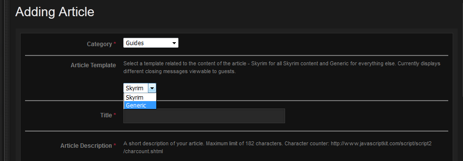
Part of the form required when adding articles and guides.
Having done that, I also changed many of the fields and directions to be more self-explanatory. I've included the requirements for the images, maximum character lengths, and explanations of all options. Hopefully it helps make it all seem less daunting.
Article Template
As seen in the form above, I also created an option for an article template that I've custom coded for our content. Depending on whether you select "Generic" (normal articles) or "Skyrim" (everything somewhat related to Skyrim, obviously) guests will see one of two different footer messages automatically added to the end of your article.
First of all, the default Generic...
Or the often-used Skyrim version...
In the future I expect the templates to be drastically different, but for now the guest footer message is all I've included.
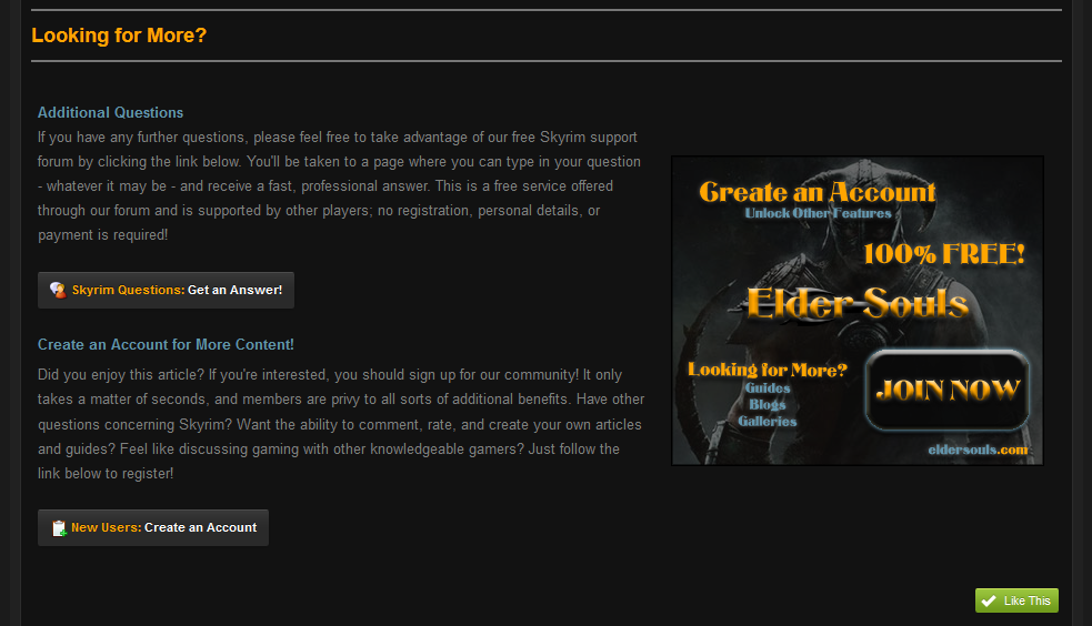
Custom Images and Advertisements
If you were paying attention to those last two images, you probably noticed that we now have pretty sexy new images promoting Elder Souls. These were all made by our RuneScape Category Moderator, Anarchy, who was kind enough to devote his talents to us for free and has so far made us several different versions...


These will slowly replace/rotate with existing advertisements in various locations on the site.
Staff Updates
Going right along with our re-worked articles system, we've recently introduced a new staff position: Publisher. This name isn't final, but I expect it will stick around a little while longer unless someone comes up with something more suitable soon. Anyways, this position will be primarily tasked with writing and submitting new articles to our database. Our most recent (and first) promotion to this position is Squishyman, who has already completed a fantastic article, The Different Types of Gamers.
Open Positions
We're always going to be looking to acquire new volunteers who are interested in writing and publishing their own content, so if you're interested in this position I recommend checking out our most recent staff application.
Miscellaneous
Last (and also least), was a small change to our forum navigation. I replaced "Elder Souls" on the forum tree navigation with a small home symbol. I don't know why I'm even including this; probably to see if anyone actually noticed it. It solves some issues with wrapping on low resolutions, although the benefit is probably negligible
 .
.A small, cozy home button.
Please leave your thoughts and suggestions in the comments below! I will be reading all of them.
6 Comments
Recommended Comments