Back in gaming’s past, developers didn’t have a lot to choose from in terms of art styles. They usually just tried to go for a realistic approach. Of course, back then, the term “realistic†was used very loosely, and usually just meant that the group of pixels resembled a person. Nowadays, however, developers have a lot more to work with, with better technology and many different engines to develop their games on. With that choice comes different graphic styles that developers can choose from. What are the different styles? Well, that’s what this article is about.
Realistic
The style of choice for shooters, realistic graphics try to make the game look as close to real life as possible. The color palette tends to be lacking, especially in the shooters I mentioned earlier. However, games like Mass Effect and Ocarina of Time are still able to make the games colorful while still looking realistic.
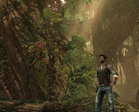
A Game That Did It Right: Uncharted 2: Among Thieves
Uncharted 2 set a new quality standard for graphics in the Ps3 exclusives. While the first game focused on a jungle environment, the sequel took place in many different environments, such as cities, mountains, and ruins. The level of detail in each of these areas was astonishing, and the Uncharted series still sets the gold standard for Ps3 graphics.
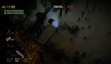
A Game That Didn't: Dead Nation
If you look at most top-down shooters on the market, they tend to have cartoony or at least semi-realistic art styles. There is a reason for this, and it is one of the reasons why I gave Dead Nation a mediocre score in my game review. In a realistic world, the brown zombies blend right in with the dark cities, which can give you a lot of frustration. You may not see a zombie when he is right in front of you. You want sharp contrasts in color when making a game like Dead Nation.
Other games that use this style include Skyrim, Dragon Age: Origins, and Heavy Rain.
Cartoony
This style goes in the opposite direction of realistic, and makes no attempt to convince you otherwise. The action is usually colorful and over the top. This style is prevalent in flash games, handheld games, and most Nintendo games, but there are other obvious examples as well.
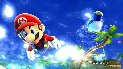
A Game That Did It Right: Super Mario Galaxy
Super Mario Galaxy is a game that has it all when it comes to setting. You travel to more than 20 different galaxies, and while there are a few similar ones, most give a unique experience unlike the others. However, none of these environments exist in the real world, and are actually quite zany in design. What better way to convey that than with a cartoony art style that gives you artistic freedom in each and every environment?
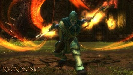
A Game That Didn't: Kingdoms of Amalur: Reckoning
The developers of this game tried to add a bit of charm by giving a style similar to World of Warcraft. While many people liked this direction, I personally didn’t. I really couldn’t take the game seriously while I was playing the demo. Everything looked disproportioned, and overall the world felt very artificial. Regardless, I plan to pick the game up next time it’s on sale. I just feel the graphics didn’t really fit.
Other games that use this style include World of Warcraft, The Wind Waker, and Castle Crashers.
Artistic
This style shows the creative vision of the studio when designing the game, and these graphics show up a lot in indie titles. There could be many flashes of color, very bold outlines, or an abstract direction, and many of these games are remembered fondly for their art style.
A Game That Did It Right: Armed with Wings
What is Armed with Wings, you may ask? It is a series of flash games about an ancient warrior trying to take down a tyrant. The game is completely based off of silhouettes, and you can see the dust rising and falling as you run. I feel that the games felt much more dark and emotional with this style, and I would highly recommend a playthrough. The first game is “meh,†but the rest are amazing.

A Game That Didn't: Mirror’s Edge (cutscenes)
The actual gameplay graphics of Mirror’s Edge fall into the next category, as it takes place in a clean and colorful city. However, one of the biggest complaints about the game was its cutscenes. They looked like E-Trade commercials. I absolutely felt ridiculous watching them, and ended up skipping many of them. They didn’t fit with the mood of the game AT ALL, instead taking away from the experience. I hope that if DICE gets around to Mirror’s Edge 2, they will use the gameplay graphics for cutscenes.
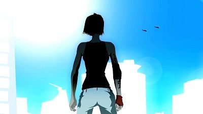
Other games that use this style include El Shaddai: Ascention of the Metatron, Child of Eden, and Okami.
Semi-Realistic
Some games may want to look realistic, but they don’t take place in a realistic setting. Or maybe they want to use more color. The semi-realistic style captures these environments. They tend to be fantasy oriented titles, but there are modern day examples, as well.
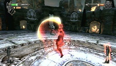
A Game That Did It Right: Castlevania: Lords of Shadow
How could you not love the way this game looked? The environments were so full of color and were very varied. This may sound strange, but watching an enemy explode in a shower of blood looked somehow…graceful. You couldn’t control the camera in this game, and the result was having a perfect view of some stunning vistas. This game is in the top 5 for best visuals of all time, in my opinion.
A Game That Didn't: Fist of the North Star: Ken’s Rage
Chances are, you’ve never heard of this game. It was very niche in the west, but a hit in Japan. The game is pretty much a linear Dynasty Warriors with martial arts instead of swords. I bought it, and while it was a fun game, there was little to no color in the game. Sure, it was a post apocalypse, but all the areas seemed to look the same, save the beginning and end of the game. However, that is not my main gripe. My main gripe is the NPCs. I noticed this when doing a side diversion involving saving villagers from monsters. EVERY SINGLE NPC LOOKS EXACTLY THE SAME. This isn’t an exaggeration. The NPCs have the same character model. I facepalmed when I saw that.
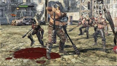
Other games that use this style include Mirror’s Edge, Dragon Age 2, and Dynasty Warriors 7.
Retro
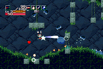
This style is used when a developer wants to make a tribute to the golden age of gaming. You can clearly see the pixels and the animations are simple. Synthesizer music goes hand in hand with these graphics.
A Game That Did It Right: Cave Story
If you haven’t played Cave Story, I have one thing to say. Download it. Right. Now. This game was a piece of freeware created by one man in his spare time. I consider it to be one of my favorite side-scrollers of all time. The game was made to be a tribute to games like Metroid and Castlevania. While I haven’t played much of either of those series, from what I have experienced from them I can say that this title captures that feel well. I also felt that a bit of Mega Man was sprinkled in, however. From the charming soundtrack to the lovable character models, this game will stick in your memory forever.
A Game That Didn't: ET: The Video Game
I guess this isn’t exactly “retro,†since it actually was an old game, but come on, cut me some slack. You see the screenshot? Those green patterns in the background are TREES. I mean, even by Atari standards, this was pretty bad.
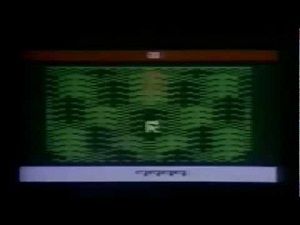
Games that use this style include 3D Dot Game Heroes, Mega Man, and Realm of the Mad God.
And those are the different graphic styles of gaming! Are there any games you have seen that don't fit into any category? Also, how important is the art style in terms of immersion, in your opinion? What's your favorite, and what's your least favorite? What do you think the developers favor? Leave your responses in the comments.



Recommended Comments
Join the conversation
You can post now and register later. If you have an account, sign in now to post with your account.