Jump to content
  • entries
    13
  • comments
    62
  • views
    73853

Pay No Attention To The Man Behind The Curtain


David

7724 views

It's been a long time since I've bothered to document any changes/updates that have either been completed or are in the works. Mainly because no one ever reads/responds to these blogs.

Since I miss the days of 2-3 new, original blog posts a week, I figured that I may as well take the plunge and post a quick one of my own.

The Header

Remember the days when navigation consisted of bookmarking "View New Content"? Pepperidge Farm remembers.

NewStatic_zps3bbfc835.png

Nothing really fancy here, but you knew that already. You've been staring at it for months, after all. But if I didn't include ancient changes I would have nothing to write about here, would I?

At any rate, since the purpose of these is to generally explain why I changed what I did (because fuck change, damn it), I suppose I'll delve into that...

The Logo

Since I know the majority of you have alzheimers here's what it used to look like.

oldlogo_zps91d20532.png

Sort of bummed the logo is now gone from the top, but I have OCD about things being symmetrical. My reasons for switching it up are actually that petty for most things.

The Category Menu

This is the black fade-in/out thing that no one actually uses. Did you notice it even changed? Probably not. Want to know what did, after months of arduous planning, engineering, and development?

I got the drop-down columns to light-up in white when you hover over a sub-element.

avatar_d33b8bcb7a3a_128.png

I also re-ordered everything so that it, you know, made some sort of logical sense. But no one cares about that.

Fa-Fa-Fa-Facebook Likes

Every day, as soon as I wake up, I jump out of bed and sprint to my laptop. I then quickly load the site to see if we've received any new Facebook likes. The number 37 once again appears before my eyes and I just think to myself, "There's always tomorrow."

This has gone on for 4 months.

Meanwhile, rival sites have been created from scratch, thrown up a Facebook page, and are now over 1k likes over the same 4 month period. It made me sad.

Following a few hours of frustrated crying I decided that I NEED MORE LIEKS and that EVERYONE should ALWAYS have to STARE INTENSELY at the facebook like counter as it scrolls with them ON EVERY PAGE AT ALL TIMES.

It's been 2 weeks now and we still have 37 likes.

Buttons, Lel

To quote Blexun, "somethingsomething Fancy somethingsomething I'm gay." At least that's what I think he said.

The main point is that the buttons are, like, beveled and stuff, man. Here's what they used to look like.

oldbuttons_zps25e5b49c.png

This was all fine and dandy for damn near a year, if not longer. Then, one fateful day, I accidentally copy-pasta'd the CSS for the above buttons into itself.

tumblr_m1snhrBnBm1rngjayo1_500.gif

The resulting abomination was surprisingly appealing, and it is now....

newbuttons_zpsf189874a.png

A wild incompetent Admin appeared! God used Buttonception. It was super effective!

David vs. "Where's Lydia?"

Once upon a time someone posted the 15th thread about "omg lel I lost Lydia wut do?" After writing painfully detailed "If you did X, then you must now Y" solutions 14 times, I typed up about a paragraph in all caps tearing the person a new asshole for daring to not just search for an existing answer.

After finishing my rant, I realized that since we switched to the new skin, I had never re-added the search function.

So here we are. People are now able to search everything to their heart's content. The Lydia threads have at least slowed. Brad continues to post pictures of himself pooping dildos in the Premium forum.

This is all because some kind soul told me to re-add the search bar through a Lydia question.

Social Media

This was added because I liked the little grey-scaled icons next to the links. Yep, that's the only reason. In fact, as Jake pointed out a few weeks ago, the Youtube link goes no where. Because fuck you for clicking it.

The Footer

I was sort of annoyed with the boring black line at the bottom of every page, so out it went. I was pretty happy after another several weeks led me to the final result below; a boring black line with a boring gray line on top of it.

footer_zpsdb6cfa65.png

Did you know that hovering over our logo not only causes the thing to fucking GLOW, but clicking it will bring you to the top of the page? Of course you didn't. You really need to slow down and just smell the roses, man, it's the little things in life like this you need to appreciate.

We Have a Privacy Policy

No part of our website is structured to attract anyone under 13. NO. PART. OF. THIS. WEBSITE.

  • Please disregard all textual references regarding video games.
  • Please disregard all images regarding video games on this website, especially the 8 million pixel HD background image.
  • Please disregard the gray-scale theme, clearly intended for the Male Under 25 demographic.

Please disregard this website. Also don't sue me and stuff, because all I have are empty pizza boxes and unused condoms filled with taco sauce.

© 2013 ElderSouls.com

I will sue you, though.

The Background

It has snow-capped mountains and trees and things. Also it fades into dirt. That's sort of cool. I guess.

So? Why am I here?

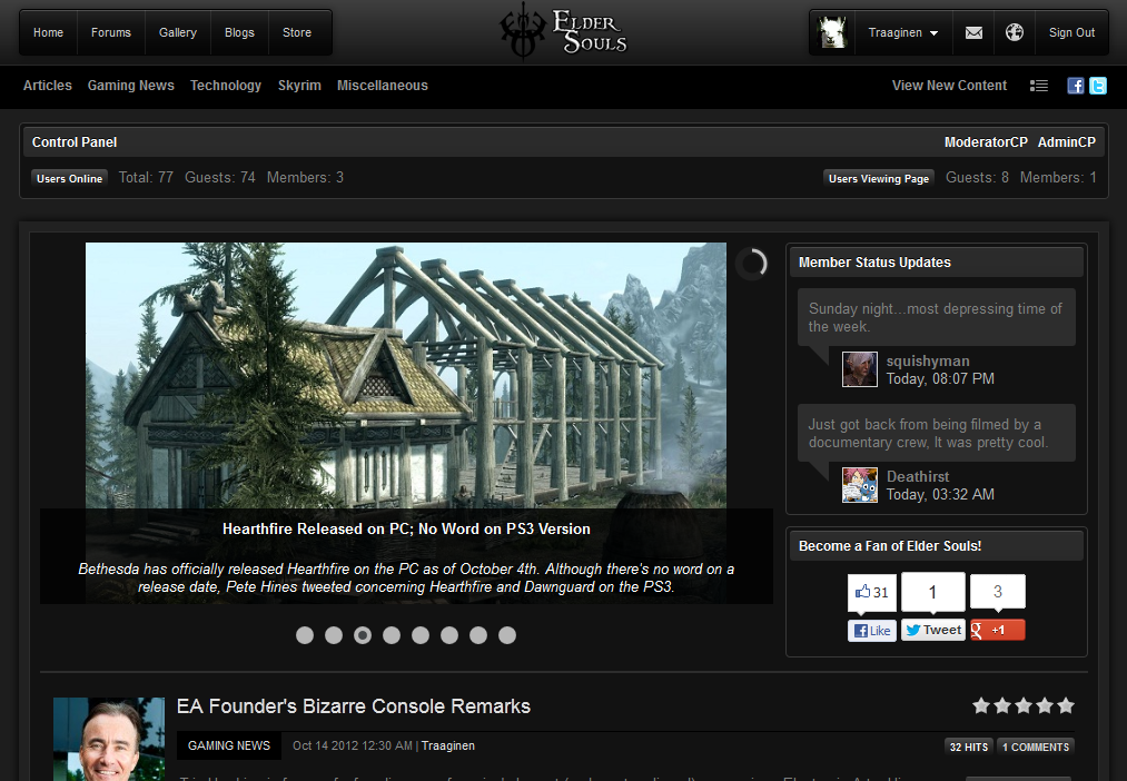
I don't know, man, this is pretty pointless. It's also 4:20am (huehuehue) and I don't know why I'm still up. Here's what all of the above changes have added up to, though.

Here is the old. Click to enlarge, obviously.
oldscreencap_zps86385ecb.png

Contrasted with the new that I started this blog with. You are now shocked. Just try not to seize up and die in amazement because I only have 3 readers and need all of you.

9 Comments


Recommended Comments

You forgot to mention the big square Elder Souls button that skyrockets you to the top of the page.


I honestly don't know how long that was there. I just noticed it like 2 weeks ago. Or maybe it was just one week ago.


Personally though, I need to start cranking out blogs again. I just need inspiration.

Link to comment

You forgot to mention the big square Elder Souls button that skyrockets you to the top of the page.


I honestly don't know how long that was there. I just noticed it like 2 weeks ago. Or maybe it was just one week ago.


Personally though, I need to start cranking out blogs again. I just need inspiration.


Actually I didn't. L2Read. ;) Edit: (nvm, the joke went over my head. I am shamed).


However, now that I have a few hours of sleep in me I realized I did forget 3-4 small things as well as the entire reason I started the blog in the first place. Oh well, I guess that means I can write another entry in a few days.


And you really should, I enjoy reading your stuff. Your Netflix blog has nearly 3k views from actual search traffic.


I try to tell all my friends about this website, but unfortunately, none of them care enough to like it. Such a shame.


Eh, I haven't Liked it myself to be honest. Though that's because it seems slightly narcissistic.


Hell, I would sleep with myself if I could, though. So why not?


Pfft, David thinks we don't notice his changes!


I know my 3 readers notice, just no one else. <3

Link to comment

Am I not one of your readers? And yes, I did notice these things... Like the logo at the bottom. I accidently hovered over it and saw it glow. It made me so amazed I had to click it!


When I wrote "3 readers" I was just trying to joke a bit that it wasn't a lot, not that it was literally just Blex, Jake, and Fergal. Then they were the only 3 that commented and a little bit of me died inside while another part laughed.

Link to comment

There i gave your FB page a like so now you went from 36 to 37. :D


FB is the devil. This is my first visit to your page and I found it through some other page that has an astronomical fanbase already, apparently. (tesof.com) I was scouting out other websites to see their layout/design/content as I have a domain that I'm not using for elder scrolls. I don't think I can ever develop a website as pretty as yours or the other sites...but bleh. 


I have run another website for over a year and I was getting pretty pissy at FB likes and how another website that launched after mine with half the content skyrocketed in popularity. It really ticked me off. Especially since their site kinda sucked. Anyways, long story short..i got pissed and ended up paying 5.00 for 200 likes to my FB page so it made it look like it had visits (i.e. the more likes you have the more prone to getting more likes..because people tend to "flock" to websites/pages that have more likes..more trustworthy or something..whichever). 


Anyways, don't despair over your FB likes. SOme of those popular sites out there probably paid for clicks/likes. Just saying. 


The one thing that might help your page is ...I couldn't find how to find your FB page without hardcore staring for it. The average person...probably won't do that. 


Okay..written a book...so..umm....i'm going to just..um....*trips over cat* 

  • Upvote 2
Link to comment

There i gave your FB page a like so now you went from 36 to 37. :D

It is appreciated!


FB is the devil. This is my first visit to your page and I found it through some other page that has an astronomical fanbase already, apparently. (tesof.com)

Ah, yes. I know of them. Did you find us through their link directory?


tesof is one site that has skyrocketed because Zenimax has repeatedly advertised them on the official Twitter/Facebook for some reason. I can only contain my jealousy by assuming someone sold their daughter/sister/girlfriend to the Zenimax Twitter manager.


I was scouting out other websites to see their layout/design/content as I have a domain that I'm not using for elder scrolls. I don't think I can ever develop a website as pretty as yours or the other sites...but bleh. 

That's probably the best thing you can do to get inspiration for your own design. I'm not really a fan of this layout compared to other TES sites out there, but content is always king anyways.


Welcome to the site, by the way. It's always good to see new users. :smile:

Link to comment

Yeh, i found your site on the directory over there. Their directory is a bit annoying though as their links aren't clickthrough so you have to copy/paste them. 


I'm actually amazed at how few of the gaming sites for Elder Scrolls aren't WP based. This makes me wonder whats wrong with wp, haha. I do like their layout..I think its just a forum as a main page..which...seemingly works for them. I'm wondering if maybe that website's owner is..related to someone in the company making the game. Only thing I can think would make them go all advertisery over them. Or maybe its someone related to another established gaming website? 


I like your website name, btw. :)

Link to comment
Guest
Add a comment...

×   Pasted as rich text.   Paste as plain text instead

  Only 75 emoji are allowed.

×   Your link has been automatically embedded.   Display as a link instead

×   Your previous content has been restored.   Clear editor

×   You cannot paste images directly. Upload or insert images from URL.

Loading...
×
×
  • Create New...