A Few Site Changes
I'll just quickly detail and explain a few changes on the site I worked on this weekend... Instead of studying for the exam that's either going to make or break my life coming up on Tuesday. Ah well, that is life.
General Badassery
Just couldn't think of a better catch-all term in all honesty, so I wrote the first thing that came to my head. If I'm right it's going to be almost the only thing displayed in the excerpt on the index, so I bet it'll get me a few cheap clicks. Suckers.
Article Updates

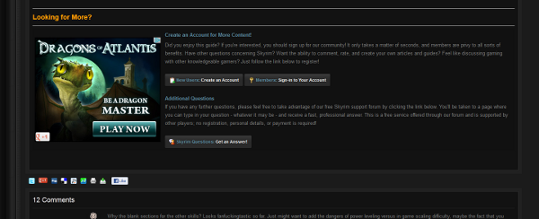
All of the articles previously had a pretty ugly and meaningless "Closing Message." I've edited the templates of the site itself to eliminate the need for having to write this into the articles. Instead, every article automatically appears with the above message to guests (members again don't have to view it). It's the standard "Join Us/Ask Questions" deal, except in a much nicer and automatic format. Most of you won't care (if any of you), but it's really quite cool when you think about how it's integrated only for certain member groups. Hint: Write some damned articles!
Guest Permisions
Guests can now comment on articles, gallery images, and (depending on what you choose as bloggers) blogs! Hopefully this results in a lot more external input from the people that view our site but never post.
TRR Guest Message
TRR also has its own guest message, only slightly edited from the ES one shown under the Different Ad Types image. I'm looking for someone to point out 4-5 good TRR-related reasons for creating an account, and after that happens I'll continue to change it.
Advertisements
I've taken some time to update the ads located on the site. As members, these changes will result in you seeing far fewer advertisements, as coding changes have enabled me to display the majority of them to guests only.
Advertisements per Group
Normal members only see the following advertisements as of now...
- Board Footer
- Sidebar of Index
Premium Members and staff are still exempt from all advertisements. Guests see everything. ![]()
Color Palette Changes

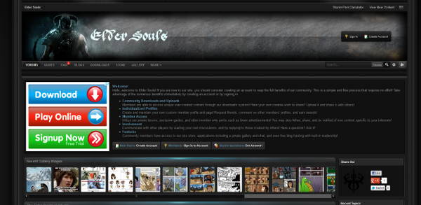
As you can see, the new color layout contrasts much more with the rest of the site. I'm experimenting with these effects and seeing how large of an impact they have on views and clicks.
Different Ad Types

As I'm sure some of you have noticed, the long and narrow advertisements have largely disappeared from the top of every page. Instead, I've changed the guest message to display larger square advertisements instead of the old ES logo. The main benefit being less advertisements users with accounts have to stare at, since generally the people that are actually interested in ad content are people that are browsing from Google or elsewhere as guests. Hence including it in the guest message none of you see.


4 Comments
Recommended Comments