Ongoing Home Page Updates
It's been awhile since I've worked on the site, so after having finished up the first round of midterm exams last week I figured I could donate a decent amount of time to it this weekend. Fortunately I've gotten a few things done!
Home Page Updates
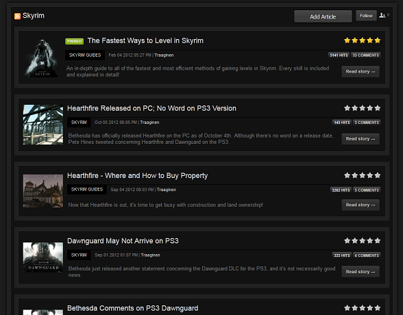
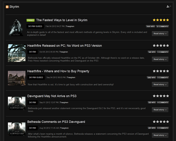
Most of you probably haven't noticed the new, less-cluttered look for categories and article blocks. I wasn't sure if I liked it at first, but the look grew on me after I looked at the redundancy of the old double-boxed in style we used to have.


The old on the left, and the new on the right.
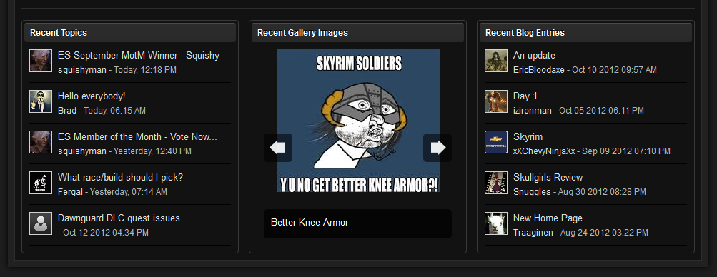
I finally got around to fixing the gallery feed that was on the home page as well. Those of you who are keen observers (or, you know, actually visit the home page occasionally) probably noticed that the feed kind of died and stopped working for a few weeks. I managed to fix it and still wasn't happy with it - what's the point of having a gallery feed that just lists the user who uploaded the last file? It was pretty pointless. I ended up re-doing it completely; the final product was an automatic/manual image rotater that will display the last 10 or so images that have been added by our members. Hopefully this is a little more useful/interesting.

Y u no get on me for not fixing this sooner?!
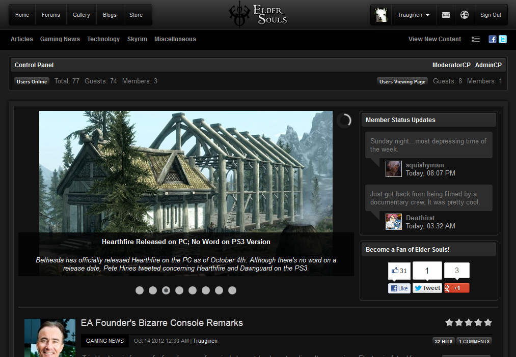
Probably the most obvious change is the new status feed that lays on the right hand side of the article slider. I'm not really happy with how it looks right now, so it will probably change soon, but for now this is what it looks like...

Because all guests want to know stranger's status updates.
Yeah, I'm not really sure about it from a guest perspective (why would they care?), but eh. I mainly wanted to shrink the slider down a bit so the images filled it up more and had nothing else to put there. After having filled the "nothing else to put here" space up with the status feed, I still had more "nothing to put here" space and re-added the old social media buttons. Those will probably stay in some format even if I move them around or change the buttons; after all, since adding them we received a new facebook like in like 30 minutes! ![]() But yeah, if you guys have any better ideas just leave them in the comments.
But yeah, if you guys have any better ideas just leave them in the comments.
There were also a few other miscellaneous updates, mostly bug fixes and spacing consistency changes. "View New Content" now points directly to active forum topics instead of your current application (which would have been recent articles). If any of you want to log out and view the home page / article pages as a guest I could use some feedback on that perspective. Or really even if you're just a normal member as I have a different page layout as an Admin.
I have also removed Disqus as a commenting system because guests never used it even though it was pretty much amazing. I figured we may as well just use our old normal system if guests aren't going to comment either way. At least now it's not going to be confusing with two different systems.
That pretty much wraps up what I've accomplished today. I do have a few more things I'd like to change around (forum reorganization, article category structure, etc) in the next day or so; if I get to it, I'll probably post a new blog then. In the mean time, leave your thoughts below!


2 Comments
Recommended Comments